Front Cover – The Masthead is typically at the top which is a standard convention for all magazines but I decided to place it on the left-hand side rather than in the middle. I challenged this convention because the word ‘Diva’ looks more sophisticated in its positioning rather than trying to spread it out in the middle as it’s not big enough. Another convention I challenged was placing my dateline at the bottom of my masthead to give it an edge and show that it is not your typical music magazine.
One convention that I used was the strapline “Inspire.Entertain.Empower” which the reader can immediately identify the values of the magazine. The other strapline I used is the strip at the top which contains other artists names and I followed this ensure my cover maintained an interesting aspects that will draw the reader. Another way to make the page stand out is the use of a puff makes the magazine seem special. The colour is eye-catching but still maintains the colour scheme. For any successful magazine, you must keep to maximum 3 colours (not including white) to make it consistent and not confusing. Majority of my sell-lines are placed on the left-hand side as the left-hand third is where people read from. A common convention for music magazines like ‘Vibe’ is not having too much information on the Front Cover. I decided to follow this as I wanted the artists to be the main focus and not have the background look crowded and messy.
 Contents Page
– There are several conventions that I followed on my Contents and there isn’t anything
I decided to challenge as I believe that the conventions fit my magazine. My Contents
was inspired by the American music magazine ‘Billboard’ that uses a lot of
tables for organisation. The main sell-lines from the cover have been
highlighted as important by placing them separately at the top. The page is
headed by a title to introduce the page so that it is easily identifiable that
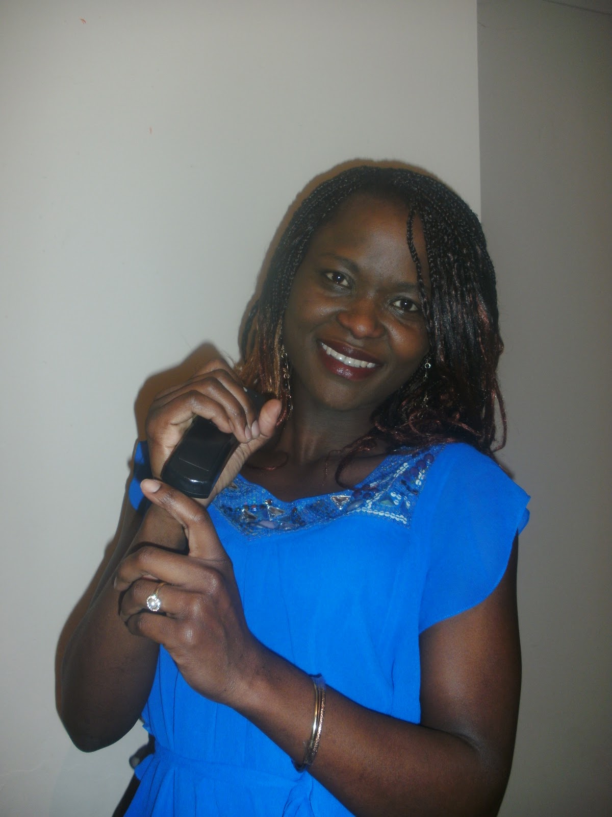
it is a ‘Contents’. Another image of the artist is placed on the page to reiterate
that this is her feature. She wears the same thing as the cover to create a
symbiotic link between the pieces and allows the fashion-lovers to see her
clothing from top to bottom. The puff gives the page a pop of colour and draws
the reader to the information.
Contents Page
– There are several conventions that I followed on my Contents and there isn’t anything
I decided to challenge as I believe that the conventions fit my magazine. My Contents
was inspired by the American music magazine ‘Billboard’ that uses a lot of
tables for organisation. The main sell-lines from the cover have been
highlighted as important by placing them separately at the top. The page is
headed by a title to introduce the page so that it is easily identifiable that
it is a ‘Contents’. Another image of the artist is placed on the page to reiterate
that this is her feature. She wears the same thing as the cover to create a
symbiotic link between the pieces and allows the fashion-lovers to see her
clothing from top to bottom. The puff gives the page a pop of colour and draws
the reader to the information.One convention that I had to follow to ensure that it looked like a Contents was sub-headings with brief descriptions. This is something you will typically see on Contents Pages and again allows the reader to identify that it’s a Contents.
 Double Page
Spread – My page keeps the convention of having a ratio of 1:1 of text to
image like seen of NME’s one on Florence Welch. As Double Page Spread’s contain
a lot of information on its page, using 50% of the page with images allows the
page not to seem to dull and boring. The headline is at the top middle and is
big and bold to draw the reader attention. I used a bold statement so that the
reader stays on the page rather than skipping past it. A convention that is
similar to this is the use of a quote from the article placed near the artist
picture. I have followed the convention of columns that are a standard convention for magazine DPS as they digest the information into easy sections to read. Also I have used a range of images on the page to show different representation of my artist.
Double Page
Spread – My page keeps the convention of having a ratio of 1:1 of text to
image like seen of NME’s one on Florence Welch. As Double Page Spread’s contain
a lot of information on its page, using 50% of the page with images allows the
page not to seem to dull and boring. The headline is at the top middle and is
big and bold to draw the reader attention. I used a bold statement so that the
reader stays on the page rather than skipping past it. A convention that is
similar to this is the use of a quote from the article placed near the artist
picture. I have followed the convention of columns that are a standard convention for magazine DPS as they digest the information into easy sections to read. Also I have used a range of images on the page to show different representation of my artist. Vibe is one of the most popular magazines to cater for the Hip Hop genre as well as the R&B genre and was a magazine that are looked for ideas. This is why the ‘Diva’ magazine would be distributed by InterMedia Partners who also distributed the special edition Vibe Vixen (which was a female-orientated equivalent to Vibe which is more male-orientated). InterMedia Partners are big on using targets to promote media and they say that they “bring extensive operating experience to media private equity to drive superior returns”. This means that making the magazine a success will be one of their main aims. This is important as in the current times, technology and the internet is a normal way of life and things like magazines are now becoming quite outdated. This is why this company would be a great benefit as their portfolio includes: Soul Train Holdings and Access Network. Soul Train is all about Soul and R&B music while Access is a media and technology platform meaning they have a good understanding of marketing with other media (e.g. commercials, television, internet). It is becoming increasingly difficult for magazines to sell so 'Diva' would need a big company that will ensure its success at the beginning of its launch and continual success.
Diva is the perfect magazine for my target audience as it combines great information for music lovers of R&B/Soul genre and other things that are considered essential in women lives. These things are fashion, gossip, events so that even if you are not a major music fanatic you can still enjoy the magazine. However the magazine is heavily music-based (which is obvious for a music magazine) and includes music news, new releases, new artists, music reviews, chart list and interview with musicians. Magazines can easily apply to the Theorist Maslow and his needs that he believe all human beings have. In Maslow's Hierarchy of Needs, Diva taps into the Social and Self-esteem need because it allows the reader to feel confident, inspired and allows you to feel comfortable when talking about music; it gives women something to talk about in the groups.It is a very different magazine with a unique selling being that it feels a niche that hasn't been catered for yet. Music magazines are dominated by males and showing women is a very sexual way. However this magazines gives the women the respect that they need and is about empowering our women with your story and music rather being the next hottest sex symbol singer.
Looking back to my Preliminary Task, my skills in Photoshop has definitely increased as I feel more confident in my use of it. I have a better understanding how to use all the tools on the software and I am very good at editing images to make people look better (e.g. adding hair, eliminating spots etc.)
I learnt that there is a lot of work that goes into making a magazine particular a music one. It is such a specific type of magazine and it seems that the market is very difficult to break into. From my questionnaire, I discovered that although people listen to music every day, music magazines don’t play a huge part in their lives. Also I have seen that Technology is greatly changing the industry and making it very difficult for new magazines as well as existing magazine to be successful. This is evident in my questionnaire, from people saying they would rather find the information on the internet and a benefit is that it is free.